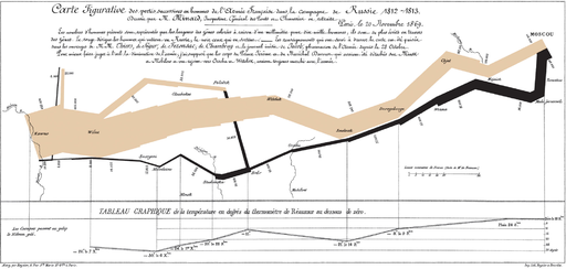
About 10 years ago I was shown the chart below, by Charles Minard. Ever since then I’ve been inspired and drawn to the world of data visualisation, so I wanted to help explain to others why this chart rocks. This short video breaks down the chart and explains the individual dimensions it’s representing, 6 in total. So have a watch and share with your analysts to hopefully inspire them to become even better data visualisers.

The Best Graph Ever Drawn
Home » Inspiration » Data Viz Showcase » The Best Graph Ever Drawn
Home » Inspiration » Data Viz Showcase » The Best Graph Ever Drawn
Table of Contents
Social Media:
Most Popular:

Free Resume Template + Data Viz = Win
January 26, 2023

Re-Viz-It | Batting Averages
October 17, 2022

Data Puking (and How To Avoid It)
August 31, 2022

Livestream Setup & Best Practices Guide
August 26, 2022
Related Posts

Free Resume Template + Data Viz = Win
Data visualization does not only to apply to quantitative data. You can also apply lots of data visualisation techniques to qualitative data too.That’s what I

Re-Viz-It | Batting Averages
In today’s Re-Viz-It we’ll be looking at an ESPN data viz focusing on the Batting Averages of the top Cricket teams from around the world. The purpose is

Data Puking (and How To Avoid It)
Problem Data Puking Have you ever created or experienced a slide, email or data visualization that is so dense and complicated, that you cannot work

Livestream Setup & Best Practices Guide
At the start of the pandemic I wrote a Livestream setup and best practices guide in Google Docs. This was to help others learn from


One Response