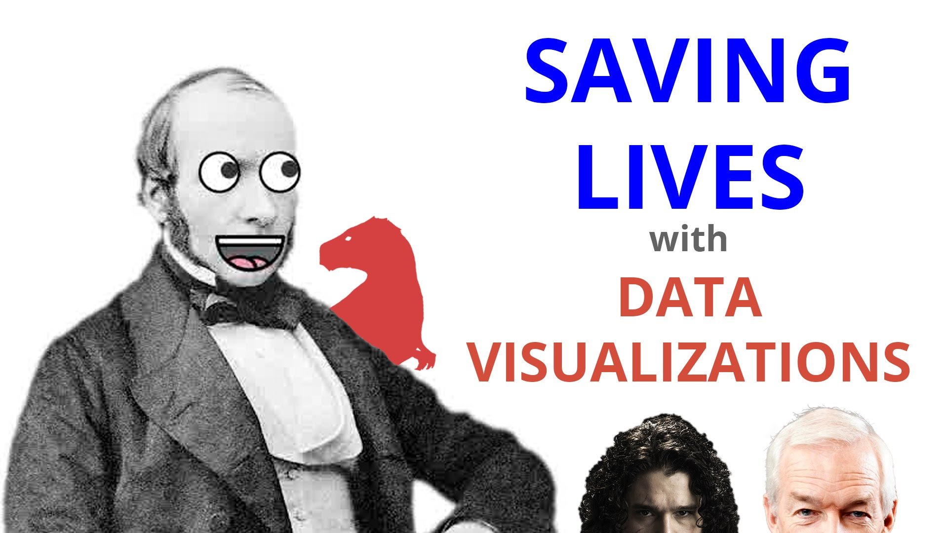
Every since I heard how John Snow saved hundreds of lives with a data visualisation over 200 years ago, I’ve been a big fan of this tale. I’ve mentioned it in presentations and even created my own interactive chart in homage to it.
To hone my storytelling skills I’ve decided to make a short 60 second video to explain the events surrounding John Snows amazing work. I hope you enjoy it and if you have any other data viz stories you’d like me to cover, let me know.


