Napoleon’s March on Russia by Charles Minard
- Positives
- Effectively shows 6 dimensions simultaneously without being confusing (see this video for more details)
- Pioneering work for the mid 19th century, inspiring countless data visualisers sheet him
- Insights
- Easy to grasp the main insight from the war; lots of soldiers left France, very few came back…
- The cold weather killed just as many soldiers as the actual warfare
- Suggestions
- Given when this was made and the technology available, it’s hard to fault it
- An interactive version would be an enhancement to discover key moments in viz. See this example.
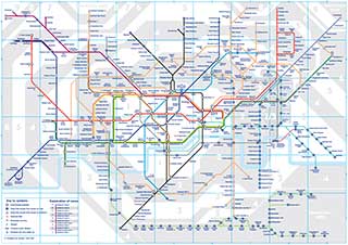
London Underground map
- Positives
- It’s simplicity, making it easy and quick to read, despite complexity
- Eliminates unnecessary data that could distract e.g. Actual geographic distance between each station
- Best practice design, other countries now emulate
- Insights
- Efficiently plan your route from one station to the next
- Find alternate routes in case of line delays or closures
- Not all data visualisations need to be numeric
- Suggestions
- Nothing really for this one. Any additions would be unnecessary given the data visualisations objective
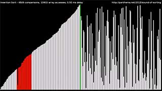
15 sorting algorithms in 6 minutes
- Positives
- Easily conveys a potentially complex and boring topic in a fun and interesting way
- Accessible to a wide audience
- Fun for the obsessive compulsive in all of us
- Insights
- There are many different ways to approach a simple task such as sorting values from highest to lowest
- We take the complexity of algorithms for granted or think they just magically work
- Suggestions
- Show the pros and cons of each algorithm
- The sound effects. I personally don’t mind them and I can see they were added to make the video more interesting, but it doesn’t add too much and could annoying more people than it informs. There is always the mute button I suppose…
