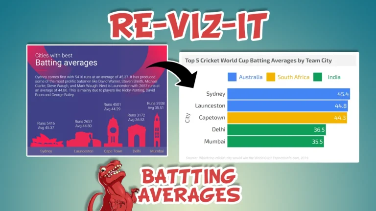
In today’s Re-Viz-It we’ll be looking at an ESPN data viz focusing on the Batting Averages of the top Cricket teams from around the world.
The purpose is to constructively provide feedback on the data viz, so we can use this as a learning experience of what not to do and how we can improve our own work. Hover your mouse over each icon to see feedback summaries and read each section for more details. I will also make a revised version of the data viz at the end, applying the feedback we cover, so you can see how the data and insights can properly stand out.
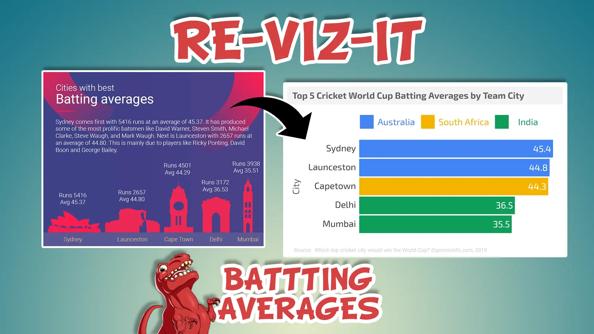
Original Data Viz
LOOKING GOOD!:
Focussed on top 5
LOOKING GOOD!:
Small use of metrics
LOOKING GOOD!:
Insights text
LOOKING GOOD!:
Additional details
COULD DO BETTER...:
Color use
COULD DO BETTER...:
Title on 2 lines
COULD DO BETTER...:
No reference to cricket
COULD DO BETTER...:
Unnecessary background image
COULD DO BETTER...:
Use of icons
COULD DO BETTER...:
Assumed metric knowledge
COULD DO BETTER...:
Size of icons
COULD DO BETTER...:
Significant figures
COULD DO BETTER...:
Lack of commas
Source: Which top cricket city would win the World Cup?
Looking good!
Focussed on top 5:
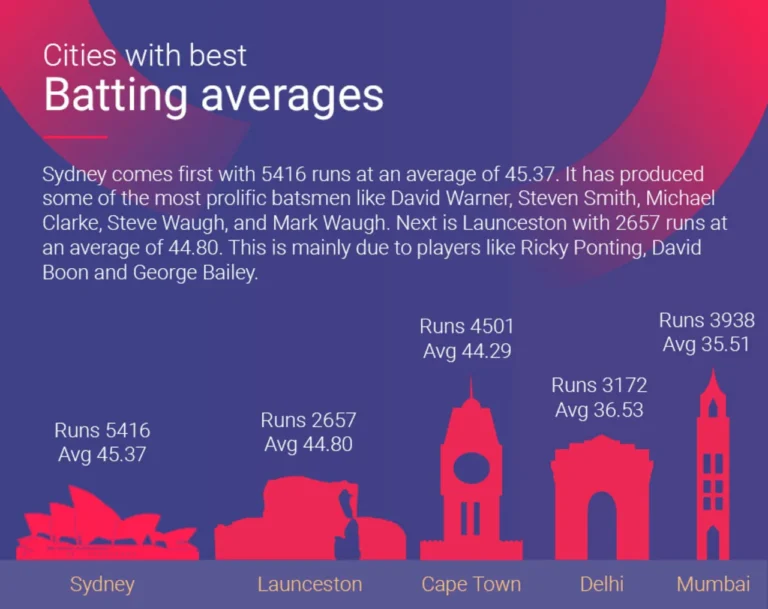
The author has kept the focus to just the top 5 cities with the best Batting Averages. It is often tempting to put lots of data points into a viz, which can make it far harder to read e.g. 20-30 cities. So it is good they kept the number low, as to not overload the viewer.
Small use of metrics:
By keeping it to only 2 metrics, total number of runs and the batting averages (average number of runs per bat), the insights remain focussed and the audience won’t get lost with superfluous extra metrics.
Insights text:
The additional text is a nice touch and can help viewers discover the same insights consistently.
Additional details:
I’m unsure if going into further details about which players helped contribute to these batting average metrics, but at least the author attempts to enrich their insights.
Could do better...
Color use:
The red on purple background are not ideal contrasting colours – making it much harder for people to read things. The yellow text at the bottom is also hard to read from the background.
Title on 2 lines:
Having the title on 2 lines for no reason increases the height of the viz and leaves empty space in the top right area, which is important real estate as most people will read that area first.
No reference to Cricket:
Batting Averages is a term used in other spots, such as baseball, so it might not be intuitive for viewers to make that connection. You could argue this data viz is on a website dedicated to Cricket, so the context is implied, but that means it cannot stand on it’s own in isolation if shared – which is often a sign of a good data viz.
Unnecessary background image:
That faded circle image at the top does not help the viewers find the insights better, it’s purely aesthetic.
Use of icons:
Most readers will not know what the icons represent and that they are meant to represent landmarks in their respective cities.
Assumed metric knowledge:
It is not explicitly stated that the “Avg.” metric is Total number of Runs divided by total number of balls hit by the bat. It is assumed all viewers will know this, but this is not the case and will confuse a lot of viewers, or make them work harder to understand this data viz.
Size of icons:
Not clear which metric they are linked to + their size does not seem to correlate to either of the metrics.
Significant figures:
Unless it is a standard in Cricket stats, going to 2 decimal places for the Batting Averages metric seems overkill when 1 would suffice. The extra numbers make it harder to parse and increase the “data ink” ratio of the viz.
Lack of commas:
It’s often best practice to put commas after each set of 3 digits in a number. It makes it much easier for people to parse the size of a number e.g. the difference between hundreds of thousands and millions.
Re-Viz-It
Clear title
Focus on 1 metric
Country Color
Bar chart
No X axis + Numbers in bars
1 decimal place
Source added
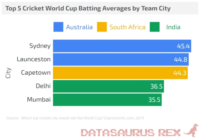
Clear title:
Summarises what the viewer is seeing, so it removes ambiguity and allows the data viz to stand on its own in isolation if shared.
Focus on 1 metric:
The main objective of the data viz was to provide insights on the teams with the best batting averages, so I just focussed on that metric. The number of runs metric was a “nice to have” and didn’t add to the viz and somewhat cluttered it, so I removed it.
Country color:
Added a color legend at the top (the first thing viewers see, to help make sense of the rest of the chart) and made each country the cities were from a different color. There was a secondary insight to see if certain countries produced teams with higher batting averages. It also helps the viewers better understand where the team cities are from, which wasn’t happening with the landmarks in the original viz e.g. could you tell what the Launceston icon was if the title below it was not present?
Bar Chart:
Easy to read and compare the numbers, as the bars size are proportionate to their respective values (unlike the icons in the original viz).
No X axis + Numbers in bars:
There are only 5 data points, so it was more efficient to add them to the bars directly, instead of keeping an entire X axis for them where the viewer would have to scan their eyes up and down constantly to see the values. Especially difficult as the top 3 values are so close to each other.
1 decimal place:
If there were minute differences between the Batting Averages, perhaps a second decimal place would be needed, but that is not the case.
Source added:
Always best practice to add sources to your charts. It reassures viewers the data is sourced well and if the data viz stands by itself, it is clear what data is fuelling it.
So there we go. Hopefully you can see how this data viz was improved using some constructive feedback, knowing what it’s objective was and applying some data viz best practices. We go into a lot more of this stuff in the Data Viz Course I am developing. It’s not ready yet, but sign up here to been informed of when it is live and grab some nice discounts.
Was there something I missed? Would you have approached this differently? Have a suggestion for a data viz I should Re-Viz-It? Let me know in the comments below.