Problem
Data Puking
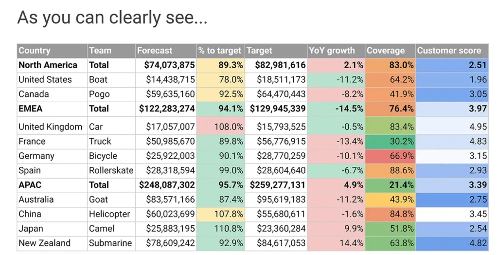
Have you ever created or experienced a slide, email or data visualization that is so dense and complicated, that you cannot work out what it is trying to communicate?

Did you or your audience exhibit the following symptoms?

This is often the bi-product of data puking; where someone has not empathised with their audience and put all of the data they have up on the screen. They assume the audience will understand it and/or have the time to find the insights buried within.
Unfortunately this assumption is often incorrect, as the audience is not intimate with the data or the way it is strucutred on the screen. It is probably their first time seeing the data, so they will need a lot of time to process it without the guidance of the person presenting it to them to make it easier to understand.

The term Data Puking is a gross metaphor. But that is literally what is happening; It’s like someone ate a bunch of data and just vomited it up onto the screen. Not nice for anyone…
How does this happen?
It’s surprisingly easy to do, as often the creator is rushed for time, and the quickest and easiest option is to not think about what you put on the screen and just put it all up.
But those few minutes saved are a false economy, as they will often have to spend many more minutes or hours trying to backtrack and explain their insights and narrative to their audience. Or at the very worst case, their narrative and insights will be missed and not factored into the audience’s decision making process!
Solution
In this video we will understand what data puking is, how to look out for it and also how to help yourself or others avoid doing it:
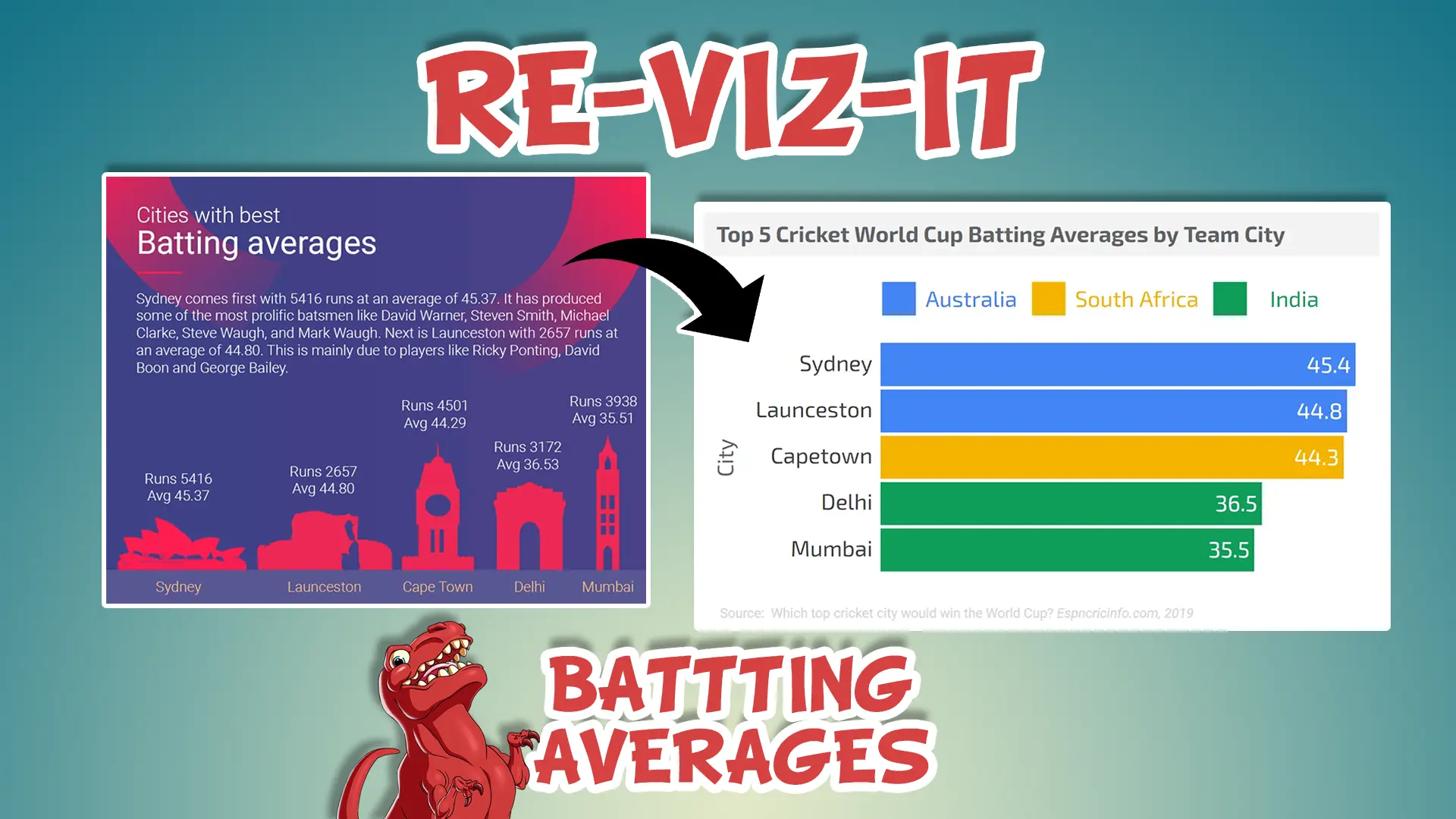
This bonus video goes into more detail of breaking down a particular bad data puke chart and ways that it can be improved:
Have you ever experienced a data puke or accidentally created one yourself? Let me know in the comments below.


