Data visualization does not only to apply to quantitative data. You can also apply lots of data visualisation techniques to qualitative data too.
That’s what I did to my CV/resume a few years ago; taking what I know about presenting data clearly and combining it with my experience hiring candidates at companies. Now I want to share these benefits with you with my free resume template!
The Goal
To put things into context, ask the 2 key questions for any data visualization; “who is my audience and what objective is my data visualisation trying to achieve?”
Your audience will be the hiring manager and others involved in your hiring process, with the objective of your cv being to convey the relevant information to get hired. All your audience wants from your CV/resume is to understand your career history and if you, your skills and experiences will help you excel in the new job. They also probably don’t have the luxury of time to read through every CV/resume in great detail. So why not help them out?
The Old Resume
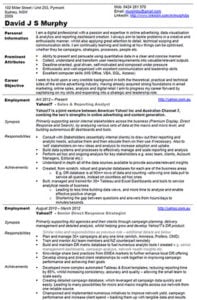
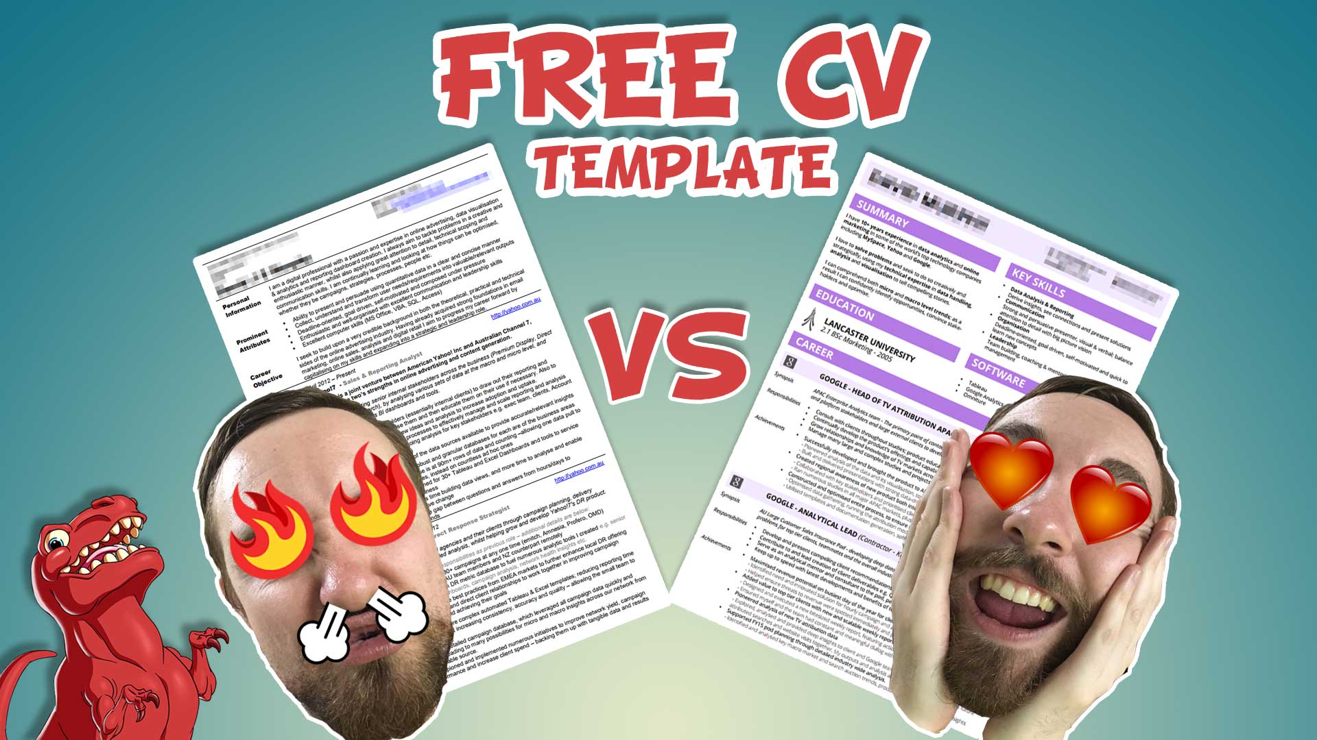
Here was my old CV/resume. It’s just a wall of text. The information is technically in there, but the hiring manager has to work really hard to go and find it.
When they’re faced with a mountain of CVs/resumes to read you are reducing your chances of success by doing this, as there is an increased risk that the hiring manager will miss vital pieces of information they need to advance you into the next round of the hiring process!
The New Resume
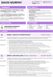
So let’s look at my new CV. At first glance it stands out, which helps. But it serves a purpose beyond that.
I’ve used a data visualisation technique called Gestalt Principles, to group things up on the page. Notice how your eyes constantly see distinct sections without me drawing lines and borders around them? This is called Proximity. The hiring manager knows where one piece of information starts and ends, helping them find the relevant pieces they care about at the time.
I’ve also used another technique called pre-attentive attributes. This helps draw the eye of the audience to the parts I want them to see first. I’ve used the colour and line width of the text to highlight the more important parts first. So if the hiring manager skim reads my cv, I’m confident they’ll see those first
I’ve also used hue and saturation to de-emphasise some of the details of each role. The hiring manager should still read them if they’re interested, but if they are rushing then I’d prefer they’d read the other parts first.
Structure
I’ve also structured each jobs information in an easy to follow format. The main thing hiring managers want to know from a role are:
- What’s the elevator pitch summary of the role?
- What were your day to day responsibilities within it?
- And what above and beyond achievements did you attain?
Following this bullet point format has the added benefit of keeping you succinct. One sentence per point is all you need. If they want to know more, they will ask you in the interview. By doing this, you’re making the hiring manager’s job easier, and more importantly ensuring they don’t miss any key details within your CV.
Also, if you work in industries with recognisable brands, it can’t hurt to include their logos. Why not leverage the instant recognition of these powerful brands? At a glance your audience will get a great sense of who you have worked for and who you have worked with.
Ideal Length
Lastly, keep it to 2 pages. If you’re just starting your career, this shouldn’t be a problem. But once you’ve worked enough long enough, are those early jobs super relevant any more? Do they need half a page dedicated to them? Sure, still mention them briefly, but your most recent roles will be the most relevant and deserve the page space. If it’s longer than 2 pages, you’ll greatly increase the chances of the hiring manager rushing through your cv and missing the important parts. You’ll also demonstrate you can’t communicate succinctly. Depending on the role, that could be a deal breaker.
Summary
So in summary, we’ve used a few simple techniques and practices to make our CV easier to read, draw the readers eye to the more important parts first, and made sure the hiring manager gets the information they need quickly and easily. Your CV will have a huge positive contrast if the other candidates CVs are poorly presented, helping you increase your chances of getting an interview.
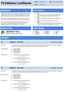 CV / Resume Template
To make a CV/Resume like mine, I used the Adobe Illustrator software. If you’d like me to make one for you, get in touch here. But I’ve also made a free resume template using Google Docs that achieves a similar job for free. Just make a copy of it, fill in your own information and then save it as a PDF.
*People become very attached to their own cv format, so try to have an open mind when seeing these tips. This format has worked well for me and when I’ve been an interviewer in past roles, CVs that follow a good layout help the candidate a lot. So feel free to pick and choose the tips from this article. I won’t be offended if you don’t use everything :)
**26 Jan 2023 Update – given all of the layoffs in the tech industry cutting close to home, I’ve decided to update this page to help others.**
