Tl;dr I animated some 19th Century time lapse photos from an awesome data visualisation book; The Visual Display of Quantitative Information, by Edward Tufte.
There were two things that clearly stick out as to what sparked my interest for data visualisation. The first was the ever so animated Hans Rosling giving a lively TED Talk.
The second was a book. The Visual Display of Quantitative Information, by Edward Tufte (link) beautifully demonstrated how data visualisation has evolved over the centuries. I won’t go into detail about it here but there was one particular section I want to bring up.
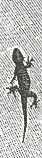
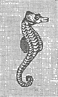
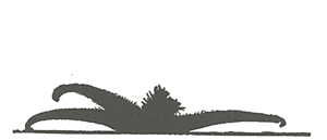
On page 36 of the book Tufte shows how a 19th Century scientist attempted to convey how a lizard walks, a seahorses fin oscillates and a starfish walks. A tricky notion given that idea video cameras hadn’t been invented yet and YouTube was still some 118 odd years away.
So they take time lapse photos of the creatures as best they can, which is remarkable given the technology they had, and put the images next to each other in order.
I decided to put my newfound animation skills to good use and give life to these images. You can see the results at the top of the page. What do you think? Do you have any time lapses you’d like to come to life? Join the Facebook page and let us know.