After using the Tableau page shelf feature for my first animated data visualisation (click here), I starting to think outside of the box.
Tableau animations are essentially one page followed by another with different visuals on it – much like how traditional animation is done. These similarities got me thinking; if they’re essentially the same in principle, why couldn’t Tableau create an ‘animation’?
HOW?
The concept of achieving this is relatively simple, but a bit tricky in practice to set up. First you need to find the animation you want, and break it down into it’s constituent frames.

SETTING UP
Each frame of the animation on Tableau is essentially a scatter chart, with each point represented by a line of data in a table with an X and Y coordinate value.
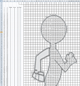
To create this data table I set up a grid in Excel so each ‘square’, compromised of two cells, had a value for where it was in the X and Y axis of the table e.g. The third cell from the left and two down from the top would have a value of (X=3 and Y=2).
To capture this into a machine readable data table there would be a separate long table with an INDIRECT function that would look up the value of each cell and return the number inside of it.
This table is what will be used in Tableau to define the points of the scatter chart. If we uploaded the table as it is now it would just be a large solid shape comprised of lots of tiny data points.
But if we deleted the values of the two cells in a particular ‘square’ this would return 0 in the X and Y columns – mean a gap would appear in the scatter chart.

With this setup in place, you can now essentially ‘cut out’ and draw the shape you want for a single frame by deleting the squares you don’t want to appear in the scatter point.
DRAWING WITH DATA
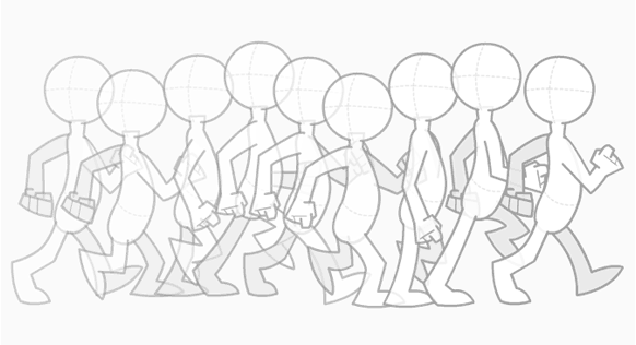
The top animation had 9 frames, so I made 9 copies of the table, inserted the image for each frame into each separate tab an
d made the images transparent using (insert excel feature name). Then I deleted the cell values of all of the ‘squares’ that didn’t fit inside the images and voila, you now have the coordinates in table form for each frame of your scatter chart animation. Can you see the shape of person walking in this cut-out?
Finally you collate these tables into a single one, making sure to label each one with a frame number in a new column (this will control the page shelf in Tableau), and upload it into Tableau.
UPLOAD & ANIMATE THE DATA
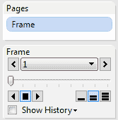
With the data in Tableau the first things you want to do are to
– Put frame dimension onto page shelf

– Put the X dimension on the X axis

– Put the Y dimension on the Y axis

– Choose the heat map visualisation under the Draw Me section
You can now play through the frames to see the animated scatter plot come to life:

COLOUR THE DATA
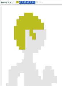
The animation looks a little bland as it only has one colour. However, we can group data points together and assign them colours. E.g. I selected the data points on the characters head, grouped them and assign it a colour to give it yellow hair.
You have to do this for each group and each page, but it’s worth it as it gives the character more depth from the flat mono-coloured shape it once had.
With the data animated and coloured you now have the finished result. There is no limitation to how far you go with this; a larger table in Excel equals a higher resolution image and more pages equals a higher frame rate – it just depends on how much time you want to invest.
With the existence of dedicated animation software you’ll probably not want to bother, but I wanted to bring my concept to life and show off how versatile good data, data visualisation and Tableau can be in the process.










4 Responses
Very creative use of Tableau. Now that I’m thinking about it, instead of a walking person may we should build a flying data monkey.
This is a very cool Tableau post — great outside the box thinking!
O my god, love it ))