First featured on the Tableau Public website. There’s a real art to data, even if it is a science. I’ve learned a thing or two about taming data, so let me share my secrets to getting it into a usable, Tableau-friendly format. I’ll give you a hint: it’s all about making it “machine-readable”.
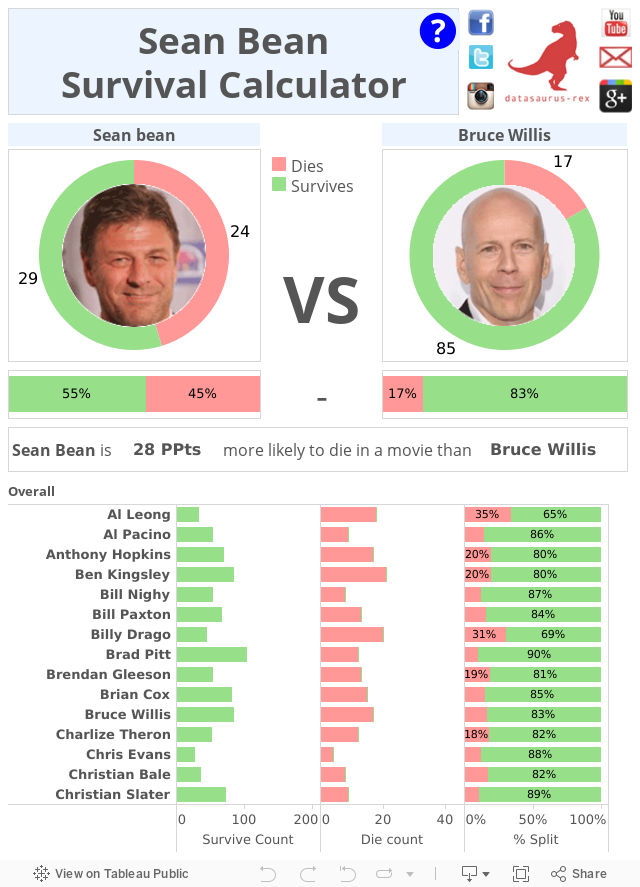
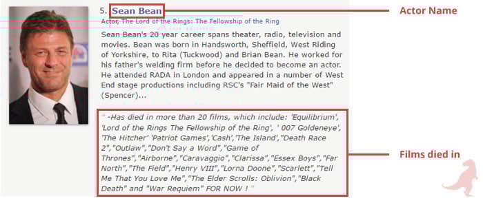
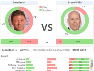
To illustrate, I’ll walk you through my latest Tableau viz, Sean Bean Survival Calculator, which I made because I wanted to know if the Sean Bean meme was justified.
1. Create one column for each dimension and measure
The data I found was just a written list. OK if you’re a human reading it, but not ideal for Tableau. Computer says no. First, I defined the dimensions and measures I would need.
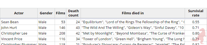
Dimensions: categorization fields, like actor name, gender and movie.
Measures: quantitative fields to count, like, total films, films died, films survived, and survival rate.
2. Find patterns to automate conversion of data
Next, I realized I had a problem. I had manually sourced the total number of films each actor starred in. This was easy, as it’s just a raw number. But I needed to count the number of films in which each actor’s character died, using a different data source.
The data was a written list, including actor name, and then a list of the films the actor died in. I had this information for 102 actors and did not want to manually count each film! I noticed a pattern. The film names were separated by commas.
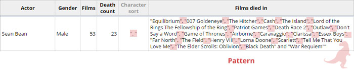
With a simple spreadsheet formula, I was able to achieve my goal.
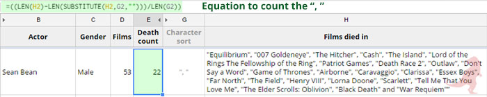
Oops – nearly forgot the ‘and’ in that list! So I added ‘+1’ at the end of the equation. And that’s your logic.
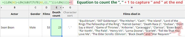
It took me 1 minute to get the death count for all the actors. There was less risk of human error, too.
3. Validate and test with a few lines of data
Before committing to complete the database, I tested 4-5 rows of sample data in Tableau. Pro tip: you can simply copy and paste your data straight into Tableau.
 I made sure my data would enable the kind of visualisations I wanted. This lets me spot gaps: for example, if I’m missing a crucial field. Or opportunities: get inspired to add something extra which could improve my story.
There you have it – 3 simple tricks to keep your data machine-readable, so you have more time to focus on discovering the insights within.