In a normal day to day office environment we deal with data whether we realise it or not. It can range from small simple Excel sheets to large complex databases.
Throughout my career I’ve dealt with both, but it’s the simpler of the two I’ve found the trickiest. The simpler data is often the most directly used and valuable to everyone in a business e.g. the targets for a sales team, a profit and loss sheet from Finance, a contact list for marketing etc.
When asked to analyse it, even though they are small, their format can make the task far more tedious and cumbersome than an analyst would like. So I often find myself requesting data in a certain way or responding to the refreshingly rare question of “how would you like the data?”
This is an important question, so I’ve decided to make a post about it; to succinctly ask/respond to these questions and help others do the same. I will be tackling it from a layman’s perspective* so we can all understand and help the masses appreciate how a few minutes spent thinking about their data formats can potentially save hours and days of their lives and that of their colleagues.
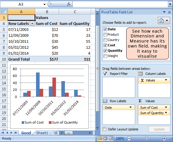
Simply put, each Dimension and Measure should have its own column:
Dimensions are the data fields that let you categorise the data e.g. date, country, region etc.
Measures are the quantitative data fields that you want to count.
Computer Readable vs. Human Readable
The most important thing we forget about analysing data on a computer is that it’s the computer doing the heavy lifting for us; we simply tell it how we would like the data output to look. With this in mind, it is the computer that needs to read the data and not a human.
The human controls the output, but the computer should dictate the input.
The best format for this is: a single table of data, with each Dimension and Measure having its own column. So when the data is uploaded into programmes such as Google Sheets, Microsoft Excel and Tableau Desktop, you can pivot the data immediately with no extra manual manipulation**.
Computers are very pedantic, so if we give them data in the wrong way, they can still read the data but it will be very hard to control the output.
Good Example
If we follow the above example of data structure, we can immediately pivot up the data and easily start shaping, filtering and sorting it – ensuring our time spent with the data is on analysis and visualisation, and not manipulating the raw data so that it can be read by a computer.

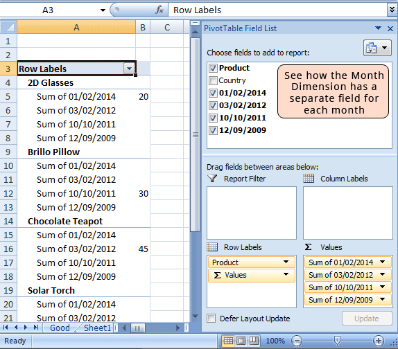
Bad Example
If we ignore the advice above and make a single Dimension in the raw data have multiple columns, we’ll make it very hard if not impossible for a computer to read the data. Even if it does, it might not be worth analysing. You’d be surprised how often I encounter this kind of data – especially where the raw data has individual columns for months, whereas they should have all been in a single column. That data is meant for humans, not computers, to read.
![]() Firstly, if you try and instantly pivot the data you’ll get an error message like this:
Firstly, if you try and instantly pivot the data you’ll get an error message like this:
So you have to spend a little time moving the raw data about**, so that a computer can read it. Even when it does, you’ll get some odd and unhelpful outputs:
Try automatically sorting the data by date, or by the highest value – the short answer is ‘you can’t’, or not easily at least. You’d have to manually go in and move each field about. This might be tolerable in this example, but what if you had hundreds or thousands of fields? It would take days to perform and chances are you’d make a mistake or two along the way. Also if new data came in, you’d have to manually perform similar tasks for an updated output. This isn’t scalable or accurate. A few minutes spent getting the data right on the front end, can potentially save days of work and reduce inaccuracy to nothing.
So next time you have to explain to someone how you’d like the data, just show them this image and say “each Dimension and Measure should have its own column” – and if they have time, get them to read this article to see how bad data can ruin everyone’s day.
*There are numerous sources out there discussing the science and more hardcore data setups, but after a cursory glance I saw that none tried to tackle it at this level. So this post by no means reflects my full knowledge on data, more so on how to effectively communicate it to a wider audience who do not specialise in this field.
**If manual manipulation does occur, you run the risk of human error creeping into your data e.g. the wrong column deleted, an extra field entered in etc. So no matter how good your data analysis skills and tools are, if there are bad inputs, you will get bad outputs. I’ve made a tool that can help you work out the time and monetary cost of this incremental manual work – to show you business when making a case for efficiencies or automation.


