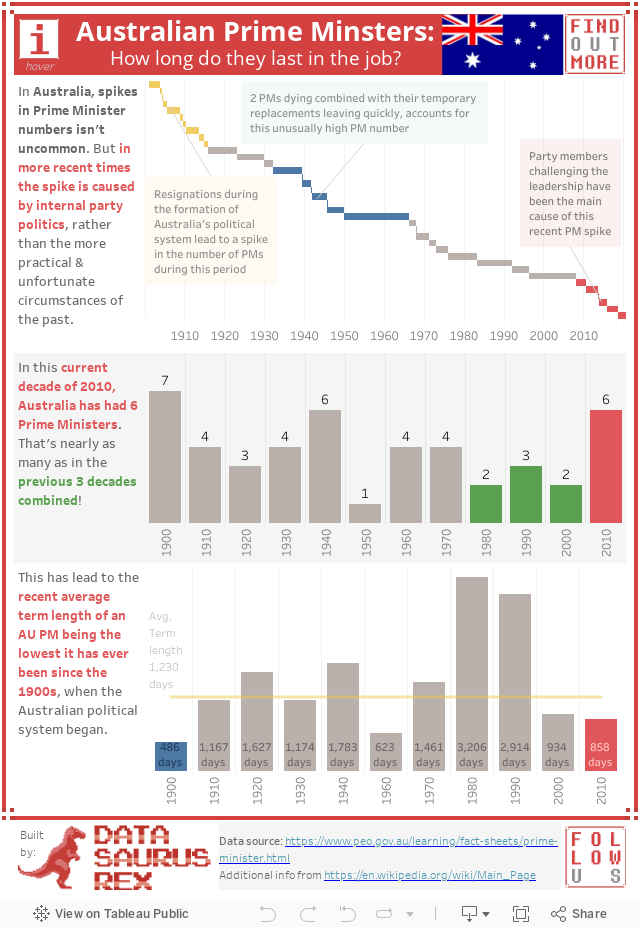
I moved to Australia back in 2010, and one thing stood out to me; the rapid frequency of Prime Ministers coming and going in their government. A good example is the leadership challenge that just removed the previous Prime Minister Malcolm Turnbull out of his position by people within his own party, without a public vote.
I wanted to see if this fast PM rotation was common in Australian politics, or more of a recent phenomenon – so I set out to visualise the data in the dashboard below.
Each bar represents a Prime Minister and the length of each bar is the duration they were PM. To get more details, hover your mouse of each bar e.g. PM picture, exact term start and end dates, days in office etc.)