Welcome to Data Chomp! A weekly bitesize video series from Datasaurus-Rex, aiming to bring you 3 great data visualisations from around the web each week.
You can check out the video above to see me covering each one; briefly discussing why they’re good, what insights we can glean from them and any recommendations to enhance them further. For more details check out each one below:
Digital Attack Map
- Positives
- Shows scale of each attack
- User friendly interface to find insights
- Clear legend handles complexity of topic
- Insights
- How big the largest attack was on October 26-7 2016 compared to others
- Most popular target country for attacks is the United States
- Suggestions
- Enhance explanation box to better educate newcomers to topic and viz
- Add links to news articles for key events for better context
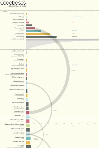
Codebase – Millions of lines of code
- Positives
- Clear introduction to explain purpose of viz
- Handles the various scales of the Y axis well
- Good comparisons between different items e.g. software and organic
- Insights
- All of Google’s code is 20 times bigger than the second largest code base
- The rapid growth and complexity of code in the last 50 years
- Suggestions
- Should visually represent line of code for human DNA, not just text
- Freeze top of chart so colour legend is seem whilst scrolling. Easy to forget what each colour represents
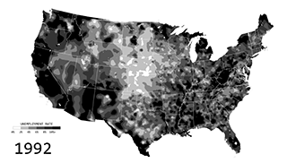
Unemployment in America, Mapped Over Time
- Positives
- Powerful and emotive way to convey the unemployment trend over time
- Get a sense of which geographic areas were most affected
- Looks very organic, like a virus spreading across the country. Reinforces negative connotations of subject matter
- Insights
- How bad the global financial crisis affected employment during the late 2000s
- No location was safe from the crisis i.e. everywhere turns black, especially in 2008 and 2011
- Suggestions
- This could have been more effectively conveyed with a simple line graph (but they acknowledge that in their post. It’s just not as fun)
Or add an animate a line graph at the top get the best of both worlds.
- This could have been more effectively conveyed with a simple line graph (but they acknowledge that in their post. It’s just not as fun)
