I meet a lot of people who are keen to introduce better data visualisation practices into their workplace when I chat to them at various data viz gatherings, such as the Tableau Conferences or the Singapore Tableau User Group I run. But I often hear the biggest barriers to these changes are their stakeholders, who either;
- Do not see the benefits good data visualisation can bring to them
- Prefer the data presented in plain numeric tables
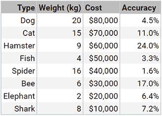
This “traditional” table on the right has the data inside of it, but it takes a while to find the insights. e.g. which animal is the heaviest? Which animal is the least accurate? You’ll get each of the answers in around 5 seconds, with lots of looking up and down the table to be sure. This would be even harder if the table has more rows.
If you encounter these 2 main barriers, I have a secret method to help subtly overcome these them; using Bar Tables:
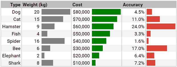
This is essentially the same tabular information in the first image, but with the addition of bars to proportionally represent the numbers next to them, for each column.
This isn’t anything mind-blowing and won’t win you any awards for data visualisation, but it is an amazing first step to overcoming the two barriers you’re facing:
Do not see the benefits good data visualisation can bring to them- Your audience will love how they can find the insights much quickly and more easily
Prefer the data presented in plain numeric tables- Your audience still gets their numbers in a table, so it won’t be rejected. It’s just a little bit enhanced…
You can easily achieve this in Google Sheets using the SPARKLINE function. This function essentially let’s you build simple charts inside of a cell – in this case it’s a 1-bar bar chart. I’ll cover sparklines in depth in another post soon, but to save you a lot of time and hassle, I have made this template:
Bar Tables template – Google Sheets
By clicking on this button, you will get a copy of my Bar Table template (another post on how to make these 1-click template URLs coming soon). You can then freely edit it to suit your actual data and needs, as I have done all of the equations and coding for you ;)
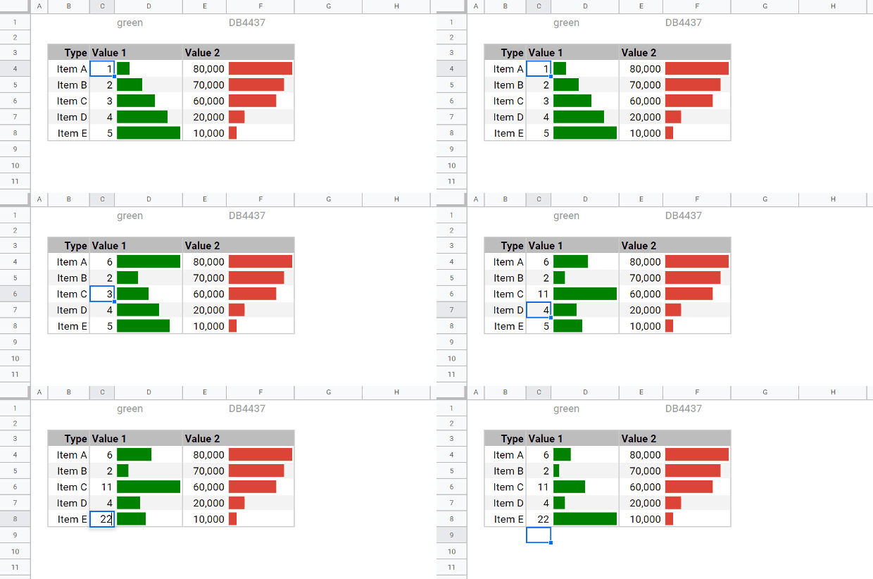
The main rule is: the maximum cell value within a column will affect the scale of all of the bars within that same column. See below how when I keep editing higher and higher values in, the scale updates automatically.
Here are some high level examples of what you can easily change:
-
Change the colours of the bars
- Type the name or hex value of the colour you want for a bars column in the corresponding cell above it on row 1
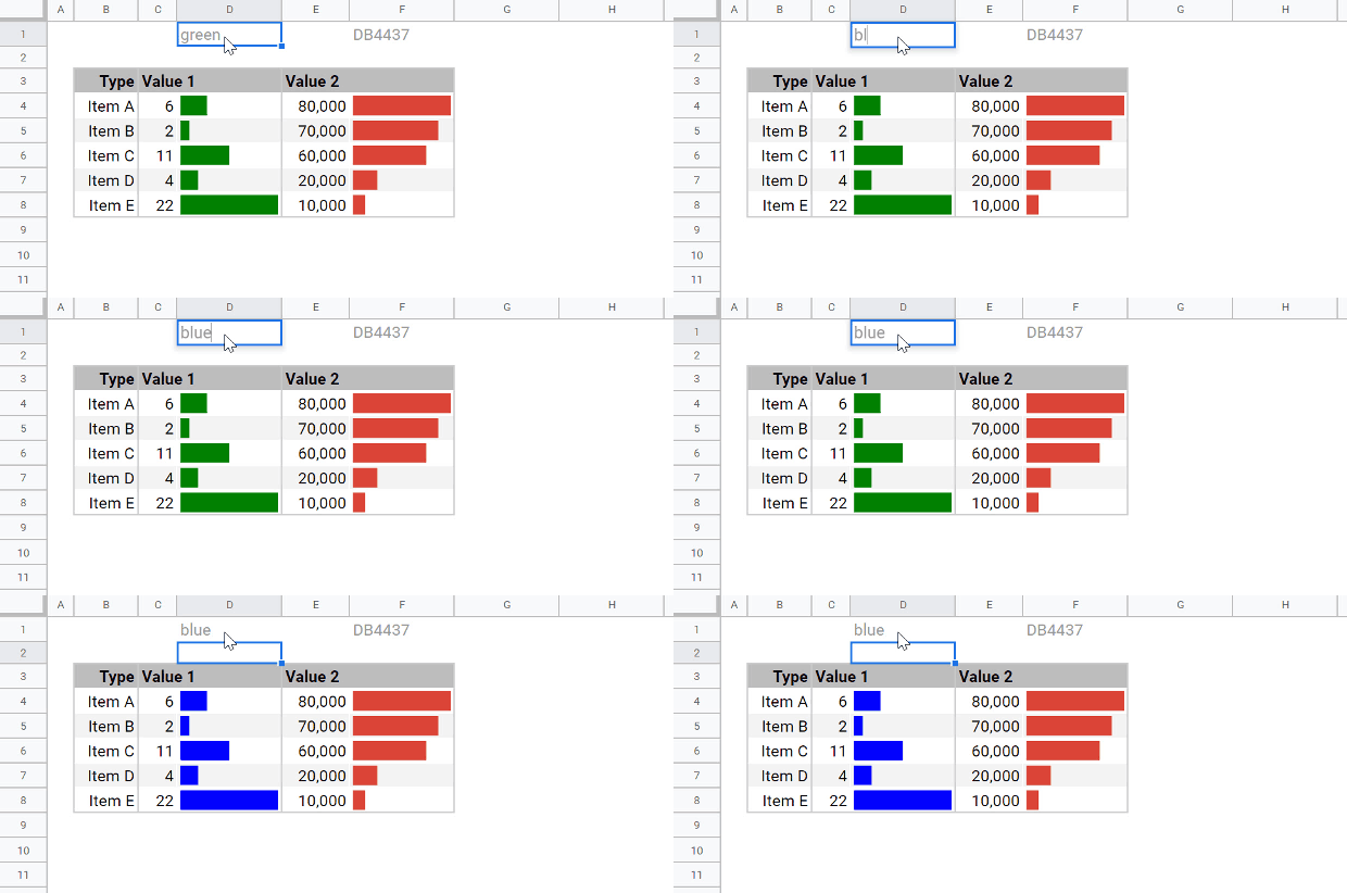
- Type the name or hex value of the colour you want for a bars column in the corresponding cell above it on row 1
-
Add new rows
- Insert new rows inbetween the existing rows and just drag the cell equations down
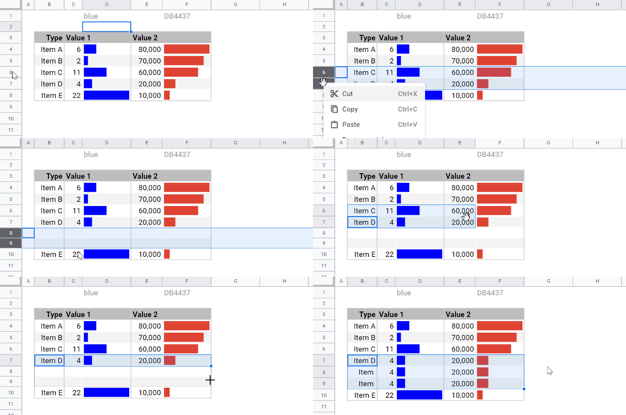
- Insert new rows inbetween the existing rows and just drag the cell equations down
-
Add new columns
- Copy the 2 columns for one value and paste/insert them at the end or inbetween other columns
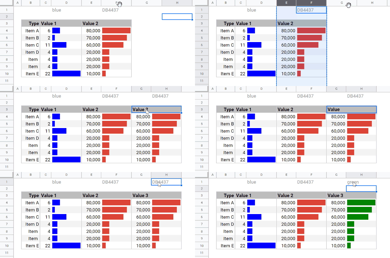
- Copy the 2 columns for one value and paste/insert them at the end or inbetween other columns
Now you can make your own bar tables in Google Sheets in seconds using this handy template. Bookmark this page to have easy access to the template copy button and you’re all set!
If you need a similar result in Google Data Studio or Tableau, I’ll be writing how-to posts soon.
Have these templates helped you out? Do you already use bar tables? Have you customised this template in some awesome way? Let me know in the comments below!
