The main objective of this site is to test and challenge my skills at conveying data into clear and relevant information. Data itself doesn’t have to be quantitative (numbers, dates, forecasts etc.), but also qualitative.
These more ‘fuzzy’ and contextual bits of data don’t follow clear and logical rules that make it easy to present them as information e.g. how cute your pet is compared to others? The challenge lies in distilling the data and finding common points to hook onto, and turn it into information. In doing this, you provide clarity and relevance to the data that let’s your audience quickly and intuitively understand what you are trying to convey.
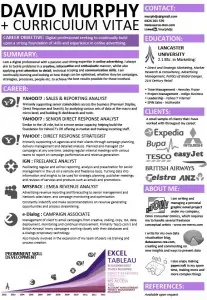 I say all of this as this post tackles the visualisation of qualitative data. What kind of data visualiser would I be if I couldn’t tackle the personal qualitative data that is my own career, aka my CV?
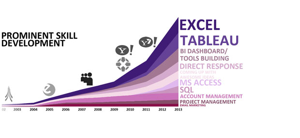
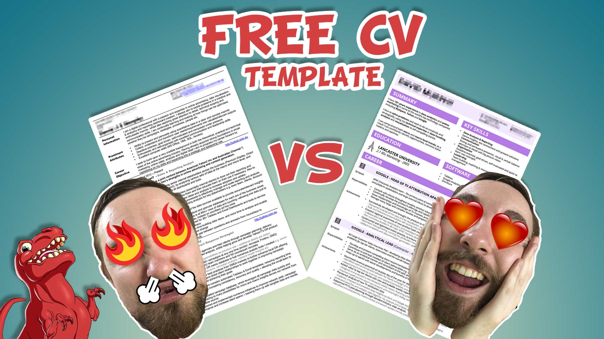
Click on the preview image to see an infographic version of my CV. Click here to see the old text based one for comparison.
The same information is in both but which one could you see what brands I’ve worked on more easily? What companies did I work at and when, and what skills did I develop in each?
In a more and more competitive working world, making yourself stand out is even more essential. Everyone’s career is different, and would need a different way to convey their career data into easily readable and understood information.
If you’re interested in me making one for you, drop me an email at [email protected]
A follow-up post will focus on breaking down my design choices for the different parts of the infographic CV, so make sure to come back and check it out.
