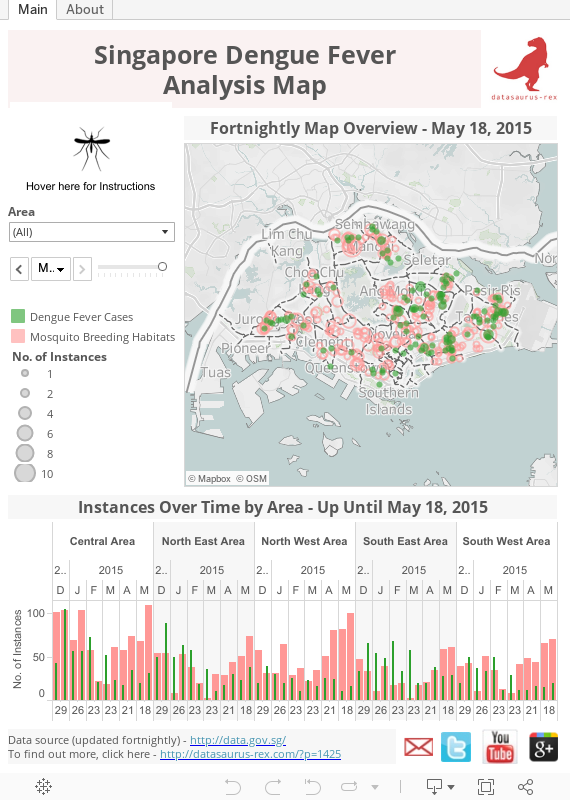
This post builds upon the previous static visualisation using Google Maps around dengue fever incidents and mosquito habitats. I discovered the data over at data.gov.sg only covered 2 weeks worth of data but was updated frequently.
So I decided to spend the last few months collecting this fortnightly data and visualise it over time using Tableau:
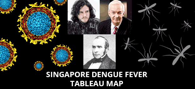
In a homage to Jon Snow (see my summary video of that here), my hope is to discover patterns and trends as time passes, to help better predict where prevention and treatment efforts should be focused e.g. do certain outbreaks or mosquito habitats flare up in certain areas during certain times or year? Is there a delay between a rise in mosquitos habitats and dengue fever outbreaks?
The Singapore data site also collects other geo spatial data which I will seek to overlay in time, to see if there is a correlation with building sites, parks, water projects etc., as the more variables we can test, the closer we can come to finding causation around the correlations. This map will be free for people to analyse and play around to help crowdsource the solution to the dengue fever problem.
So be sure to follow us on Facebook LINK, bookmark this page and check back often to see the data updated along new geo points added. If you do spot anything or have any suggestions, the easiest way to submit them is to fill out this form.
No idea is too small or silly as it could spark new lines of thought on the road to the answer. I look forward to seeing what we can come up with…