Have you ever discovered a way to speed up a process but cannot convince others to do it? Felt like you don’t have time to do the things you want to do? Wondered how much time you spend commuting or on the toilet each year? Then do I have a tool for you!
In this article you can use the Time Saver Tool and see some real time saving examples I have found with it. I’ll write a follow up post on how I made this using Tableau Public. Even though it looks simple, there is quite a lot of complexity behind the scenes to enhance the UX and data viz for the user. So be sure to follow me on social media to see when that post is live.
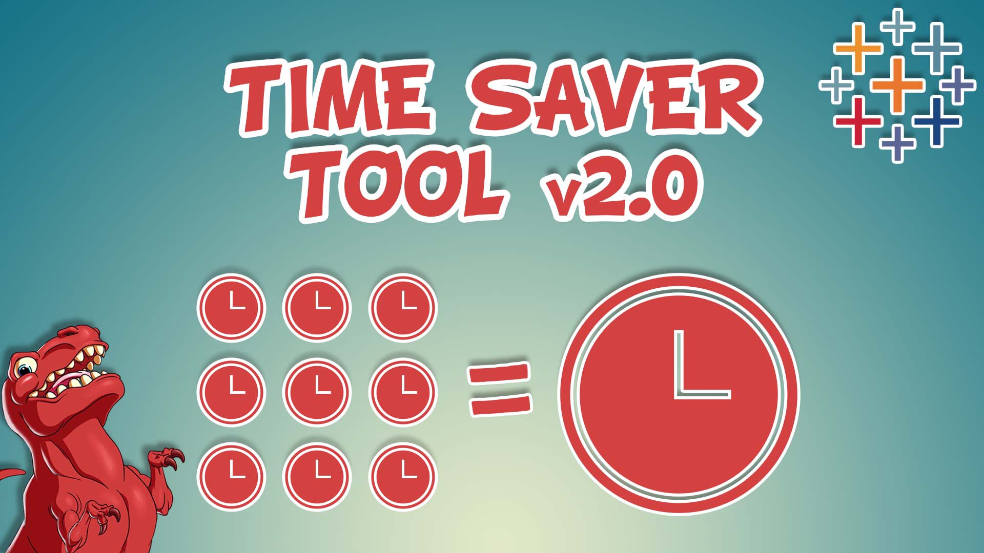
Time Saver Tool v2.0
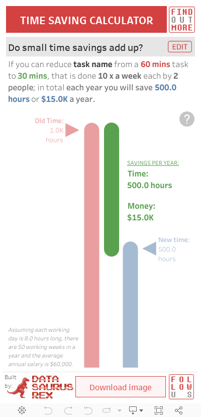
The Time Saver Tool MkII is designed to make it super easy for you to do 2 things:
- Calculate how much time and money can be saved each year, if a task or process can be completed quicker.
- Demonstrate these time savings to other people, in order to persuade them to support the new quicker process.
All you need to do is click on the edit button to bring up the input menu. From there, go through and update each input e.g. how long it takes to complete the old task, how long to do the new task, how often it is done, how many people do the task etc.
When you are happy with the values you have entered, simply close the input menu to reveal the finished data visualization. It will clearly show how much total time and money is saved in one year.
You can then download the dashboard as an image using the handy Download Image button at the bottom. This makes it easy to share on you mobile device or by adding it to a presentation slide (it’s dimensions allow you to add additional text/insights on the Slide).
If you are having trouble interacting with the viz below on mobile, click here.
Quick tip: If the time savings are too great, change the Time Saved dimension in the input menu to make them easier for people to process e.g. instead of displaying a time saving of 1,500,000 minutes, why not change the Time Saved dimension to display 12.5 working years?
Real life examples
Below are some real life examples where I have used the Time Saver Calculator, to help me or others. This is one of the defining moments for me, when I realised how powerful and effective a good data driven narrative combined with clear data visualizations could be. It cuts through to my target audience with a quick and easy way to understand to the insights and speaks their language (time and/or money).
I also learnt that by getting your audience to help input the metrics, they are more bought into the outputs, as they went on this journey with you. Compared to you just showing the end results, which can often be met with scepticism or confusion as to how you got to those numbers.
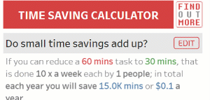
No commute this year?
In 2020 most of us had to work from home due to the global pandemic, which isn’t ideal. But to find some silver lining from that, think about how much time you have saved on your commute.
If you reduce a 60 minute commute down to 0 minutes, each way each day, you would save 500 hours of your time each year. That’s a massive time saving!
That’s a large amount of time that you could spend exercising, more time with your family or friends, learning a new skill, focussing on that promotion etc. Anything other than sitting on your butt in a car or public transport killing time.
Typically when we stop working form home, to get this kind of time saving would most likely lead to moving closer to work and an increase in rent. But now you can weigh up if that additional cost is worth it, by comparing it to how much time you lose. Chances are, it’s probably worth it…
“Give me a week and I’ll give you a year…”
Automating a process
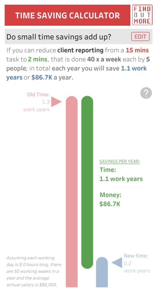
Back in an old analyst role in Australia, I built an reporting tool in Excel that automatically generated client campaign reports from a database, in a consistent and speedy manner, by only entering in a few campaign details.
The old way involved pulling data in an ad hoc fashion, waiting for it to download, formatting it, then reporting on it. The old way took about 15 minutes (on a good day), and you had about 40 campaigns a week to report on, which when added up represented a large amount of time to complete. The new automated tool took 2 minutes – effectively saving the team of 5 just over 270 working days a year – an entire headcount!
Thanks to my Time Saver Tool, I could effectively convince my boss to take a week to focus on building out the solution, as the time return on investment was clear: “…give me a week and I’ll give you a year…”
Finding the time to do something better
You can flip this dashboard in other interesting ways, to see how cutting down on one activity can free up your time to do something else that you’ve been wanting to do.
It’s hard to make extra time to do something, as we’re all busy and set in our schedules. But finding small amounts of extra time within your existing habits can prove super effective.
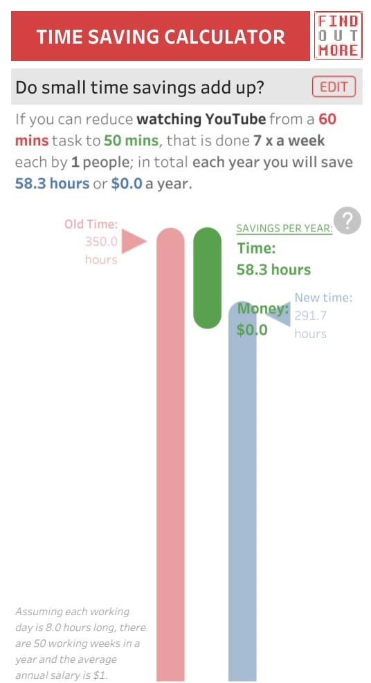
For example, I probably spend 60 minutes a day watching YouTube. If I cut that down by 10 minutes to 50 minutes a day, that would free up 58 hours a year. That’s enough time to read 7 books a year, all from a small change.
Is there something you’ve been meaning to do but haven’t found the time? Maybe this viz can help you see where you could find the time by cutting back little on some other things you do.
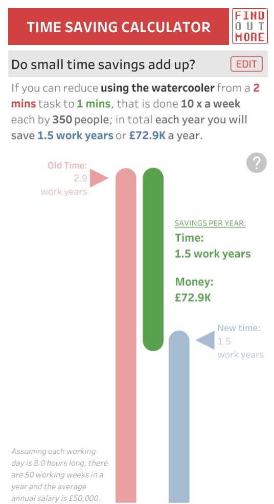
Fixing a slow watercooler
Back in a UK office that I worked in, we had a water cooler that dispensed water veeeery slowly, around 2 minutes for a decent sized glass. Ironically, whilst my mind wandered on one of these 2 minute stints, I wondered how much time the company wasted a year if all the employees were getting water.
I crunched the numbers in seconds using the Time Saver Tool and realised; that if we could speed up the water flow to be twice as fast, we’d save just over a 1.5 years worth of work hours. I was ballsy enough to send it to our sales director with a monetary value attached to this (remember, speak your audience’s language), and funnily enough within 2 days technicians arrived and fixed the water flow. You had to really hold onto your cup then, due to the pressure and speed the water would now blast out at!
I plan on updating this tool so it can show collective time losses when new inefficient processes are brought in. Just as saving 5 minutes here and there can add up to a large amount, the same can be said for the “it just takes 5 extra minutes” argument when a new inefficient process is introduced. You can technically do it now in the viz, but it’s not formatted to render negative time losses properly yet. When it is updated I’ll let everyone know – which is a great excuse for you to follow me on social media, to stay up to date on all of my content!
I hope you find this tool as useful as I have to help people see how small time savings can build up into massive time savings in a year. It will help others spend their saved time in more productive ways and also help demonstrate your impact if you are the one building the efficiencies. If this tool does help you out or if you have any suggestions to improve this, let me know on social media or in the comments below.