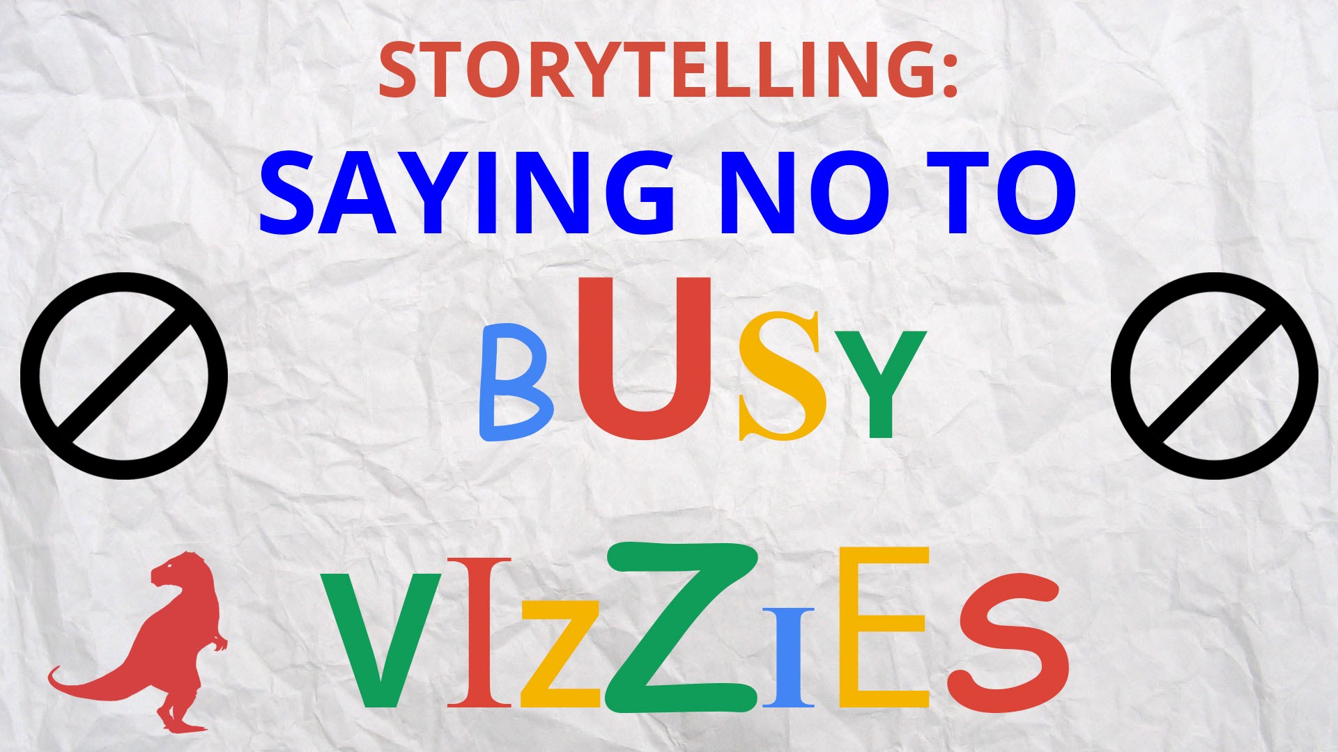
Busy Vizzies are unnecessarily cluttered charts, and I’m making it my mission to shed light on them and help stamp them out! So I made this video for you to watch and share.
I teach several courses on data visualization, and one section I make sure to focus on is to de-cluttering your graphs. Only keeping what is needed to get your insight or message across.
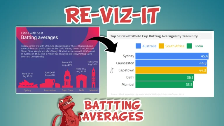
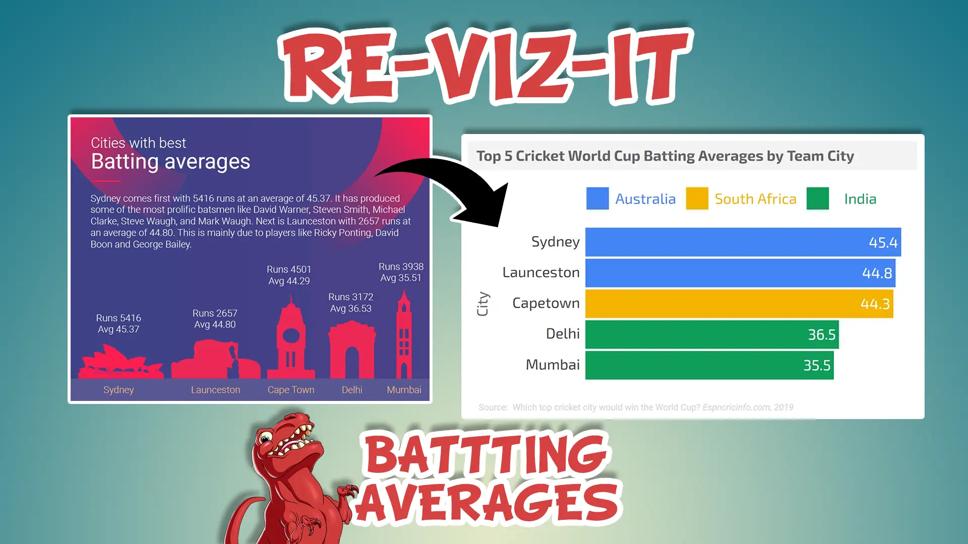
Just because you can put something in, like a background or reference lines, doesn’t mean you should. I like to think back to when I first read one of Edward Tufte’s books, The Visual Display of Quantitative Information, and came across his concept of “data ink” and it really stuck with me to adopt a minimalist approach to creating charts.
This famous post does a good job of conveying that, but I wanted to pay tribute to this concept and create a short video about it.
By giving these bad charts a name, Busy Vizzies, I hope people will become more aware of them when encountered and help people improve them. Share your before and after images on Twitter and Instagram using #busyvizzies, I’d love to see them!


One Response
Love it!!! First time viewer but will be back…