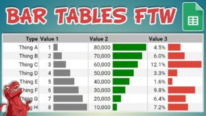
Bar Tables in Google Sheets + bonus templates
I meet a lot of people who are keen to introduce better data visualisation practices into their workplace when I chat to them at various
Datasaurus-Rex
- making Data Visualization
Fun Accessible Engaging

Welcome to the Datasaurus-Rex website, where we aim to make data visualisation fun, accessible and engaging.
The site is broken downs into two main sections. You can either Learn some useful things about data visualization to help you improve your skills or be Inspired by the data viz community and see what is possible, beyond the defaults of your spreadsheet tools.
Use the buttons above or the navigation bar at the top to start your data visualization journey today!
Welcome to the Datasaurus-Rex website, where we aim to make data visualisation fun, accessible and engaging!

I meet a lot of people who are keen to introduce better data visualisation practices into their workplace when I chat to them at various
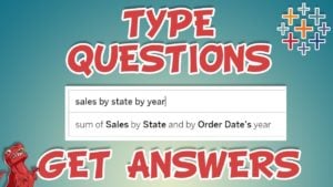
Most people analyse and interact with data in two ways: Directly, using tools like Tableau, Excel or SQL Via an analyst They both share a

(2019 Update – includes new video, updated dashboard and fresh URLs) I just received the good news that I have been selected for another year

2018 has been quite the year for me both from a personal and professional perspective. A lot of things happened to me that I am

At Tableau’s 2018 Singapore customer conference, Data Day Out, I had the pleasure of being a judge for their Data Stories of Singapore competition, Secondary
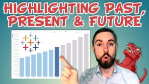
In this video we learn in Tableau Desktop how a simple calculated field can create a dimension, that can be applied to a charts colors

I meet a lot of people who are keen to introduce better data visualisation practices into their workplace when I chat to them at various

Most people analyse and interact with data in two ways: Directly, using tools like Tableau, Excel or SQL Via an analyst They both share a

(2019 Update – includes new video, updated dashboard and fresh URLs) I just received the good news that I have been selected for another year

2018 has been quite the year for me both from a personal and professional perspective. A lot of things happened to me that I am

At Tableau’s 2018 Singapore customer conference, Data Day Out, I had the pleasure of being a judge for their Data Stories of Singapore competition, Secondary

In this video we learn in Tableau Desktop how a simple calculated field can create a dimension, that can be applied to a charts colors

Sign up to The Rawr newsletter to stay up to date on new content from the site and YouTube channel.

Sign up to The Rawr newsletter to stay up to date on new content from the site and YouTube channel.