At Tableau’s 2018 Singapore customer conference, Data Day Out, I had the pleasure of being a judge for their Data Stories of Singapore competition, Secondary School and Junior College category. This involved students competing to build insightful, well designed data visualisations that informed the viewer with a strong compelling narrative (showcased later in this article). The data sources ranged from employment, environmental, aged care and female equality issues – topics adults find hard to visualise, let alone 13-15 year olds. I wasn’t an expert on any of those topics, but after the judging my knowledge and understanding increased massively (sign of a good data viz)!
tl;dr these kids all made amazing data visualisations, better than what I’ve seen most adults create!
I was blown away by each team’s passion and skill in design, storytelling and analysis. It was incredibly hard as a judge as each finalists entry was so good – even the teams who didn’t win are still winners, as these data storytelling skills will serve them very well in their future careers. Without further ado, keep on reading to be inspired and see a summary of each entry and links to their dashboard stories* – bearing in mind the age range of the entrants was 13-15. Could you have made something this good when you were that age?
Team Buona – Eunoia Junior College (1st Place)
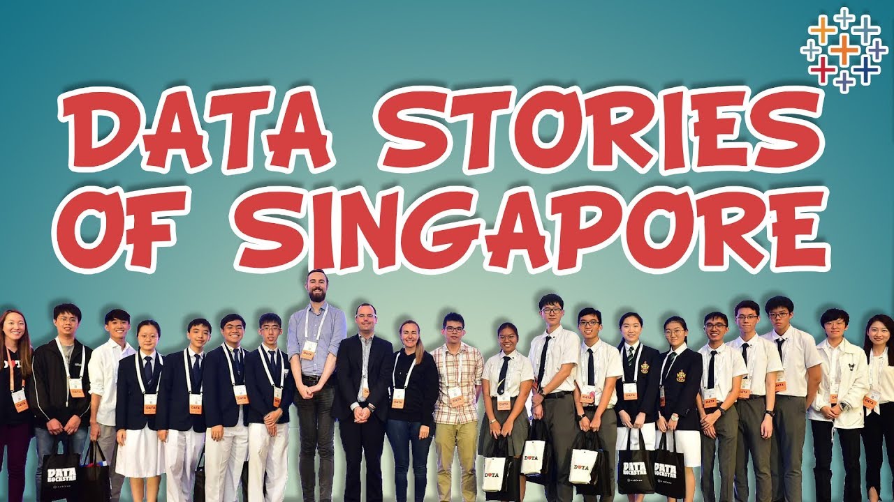
Is Singapore Building a Vibrant Economy? – Each page focuses on a specific topic, allowing the reader to follow the story and not get distracted. The headers for each page clearly outline what is being seen and summarise the key insights, clearing up any ambiguity. They also make good use of hover text help icons to add extra information on demand, instead of trying to cram it all into the dashboards limited space.
The also had a good use of custom shapes as icons and dashboard filters; making their dashboards more intuitive and interactive e.g. clicking on the hospital icon filters to only hospital information. The public transport map visualisation using the Path functionality was very impressive too – it really put their subway system into context when exploring the related data, answering the what AND where questions I had.
The overall story flowed well and was compelling. It’s all too easy to just focus on the dry financial data, but they brought in a human element to it; looking at happiness indexes, amenities, equal opportunities etc. Their live presentation of this data story was impressive too – being very articulate, confidence and pleasant to listen to.
See More, Hear More – Nan Hua High School (2nd Place)
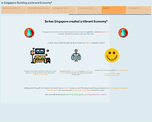
The Foreign Workforce, the Local Workforce and the Singaporean Economy – This team starts off strong with a very thought provoking question around foreign and local workforces, which shaped the overall narrative. Following on, this is naturally built upon with several data vizzes to set the scene for the reader. Each page had a good summarisation of it’s insights which was really helpful and demonstrated the team had thought about what they wanted to present on each one.
I also liked how they kept a consistent colour scheme for the types of workforce i.e. Orange = Resident and Blue = Foreign. This reduced my cognitive load when interpreting the dashboards, enabling me to understand things and spot trends much quicker and return to their story very easily. All of the analysis was relevant and it definitely felt like every insight and chart they included was carefully thought out.
There are a few minor formatting things I’d change (e.g. significant figure rounding, a more liberal use of images and using custom shapes only when it enhances a chart) – but the underlying structure, narrative and it’s presentation is very solid. Well done!
Midnight Burners – Raffles Institution (3rd Place)
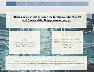
From Gender Inequality to Inclusiveness of Singapore – There were a lot of great points in this submission; again the use of action filters and custom shapes leads to a smoother user experience. The waffle chart on the parliament representation page is technically impressive and also a good fit for the data- it really puts the political gender inequality into perspective. The diverging lollipop chart for literacy levels works well too, and is a good example of when to truncate (and clearly label) the Y axis if your goal is to show small differences between to dimensions without misleading the audience i.e. none of the dimensions shapes were truncated as a result, unlike with bar charts.
There were a few instances where clearer legends and different chart usage could have helped the narrative a little e.g. some bar charts better suited as line charts to see comparative trends over time. Also the insight summaries they add to each page are great, but it could be more beneficial to put them at the top of each page. This way the reader sees the insight(s) first and then the charts back them up, instead of the other way around where the reader has to figure out what the charts are telling them first.
An impressive entry nonetheless, and overall I feel I’ve come away from the dashboard with a much better understanding of the topic.
Eunoia Security – Eunoia Junior College
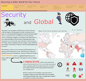
Securing a Safer Singapore – The narrative in really interesting here as Singapore is one of the safest countries in the world for physical crime, but it’s overall crime stat is let down by online phishing scams. Again, the use of hover text help icons is a great way to provide extra information on demand without cluttering up the dashboard, but it would have been nice to have some kind of call to action let the reader know they can perform that action. The ‘”what can be done?” section is a nice touch too; instead of just highlighting problems, this team also presented good solutions too. This is a key objective for most data visualisations; to spark the “why should I care?” response in the audience, immediately followed up with the “here’s how to resolve this issue” point.
I got a little lost with the narrative trying to tackle 2 large topics; cybercrime and terrorism – I feel more focus on just one topic would have provided more focus to the data driven story for the audience to follow along. Some of the metrics need a little formatting e.g. the rounding of large numbers e.g. 24,487 could be 24.5k to save on data ink. Also they truncated a bar charts y-axis which is typically a data viz no-no as it can accidentally mislead the reader.
Use Less, Waste Less – Nan Hua High School
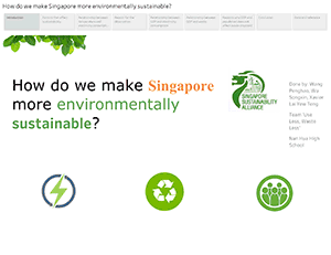
Rising GDP, Falling Environmental Sustainability? – Good use of colour (red is temperature, blue is electricity. Great 1 sentence insight summaries to guide the reader through the narrative and understand each pages charts. The insights build upon each other nicely temperature leads to electricity, leads to aircon useage and GDP. The end conclusion page wraps up the narrative nicely, summarising the insights and also makes valid suggestions to resolve the issues that were discovered.
The only two minor bits of feedback would be to reduce the number of fonts used on the opening question on the first page; why use 4 when 1 will do and make it easier to read? The second is I found myself having to scroll up and down to see each page. This could be easily fixed with the ‘fit to page’ option ticked for each dashboard, as there is enough space to display everything comfortably still.
Still an incredible entry worthy of a finalist place. It’s compelled me to really think about when I should turn my air con on at home and also be extra conscious of turning it off when I go out!
Polytechnic & University entries
There was also a category for older students from Polytechnic and Universities. Whilst I wasn’t a judge on that and I didn’t see them present their narratives, I was still super impressed with their entries. Check them out below:
- Royce Ho: Nanyang Technological University (1st Place) – Understanding Singapore’s Early Education Landscape
- Ng Wen Hui: Singapore Management University (2nd Place) – Towards a Vibrant Economy
- Cheng Yi Xing: Ngee Ann Polytechnic (3rd Place) – We Can Do a Part in Waste Reduction
- Avril Li: Temasek Polytechnic – Oh No! We Forgot to Have Children
- Wei Yifan: Temasek Polytechnic – Singapore 2035
*Each dashboard has multiple pages, so navigate through them via the little boxes at the top of each dashboard


One Response