In this video we will see how summary stats can be misleading and the importance of data viz to easily dig deeper into the numbers beneath them.
I teach data visualization to other analysts at my company, and Anscombe’s quartet is always a fun topic to cover. Often analysts (or their stakeholders), love dealing with headline and summary stats to make understanding insights easier. This is a perfectly valid approach, but as you can see with Anscombe’s quartet, sometimes great or misleading insights can be overlooked at the summary view. There is no better example than this than Anscombe’s quartet, who perfectly demonstrated how 4 wildly different sets of data can share near identical summary stats – which can only be easily seen when visualised in a graph (even in the ‘table of numbers’ format, it is hard for humans to see the patterns and trends in the data, and this example is a small data set too!).
Graphs are essential to good statistical analysis
Anscombe, F. J. (1973). “Graphs in Statistical Analysis”. American Statistician
I wanted to bring Anscombe’s quartet to life and do explaining it justice, so I put the effort into animating it into this video you are watching (going to watch) now. I hope it helps to spread the word of this small put powerful concept to more analysts and their audiences. With great tools such as Tableau, Data Studio, Excel and Sheets – there is no excuse for people to quickly go beyond the summary stats, visually, to see if there are any powerful or dangerous trends in their data sets.
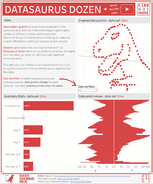
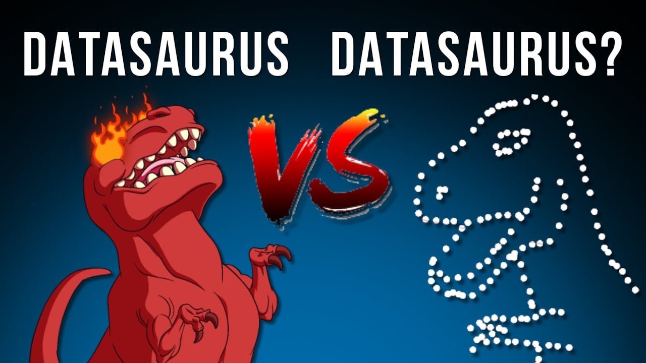
I also wanted to showcase Alberto Cairo’s iteration on this concept, with his Datasaurus Dozen data set. Showing again, show different data sets can share near identical summary stats, but when graphed are extremely visually different – to the point he draws various distinct shapes and even a “Datasaurus” with his data sets. On a side note, it was also nice to cheekily draw the comparison to my own Datasaurus-Rex name, which was created a good 3+ years before Alberto named his data set the Datasaurus Dozen (making SEO super fun for me!). But in all seriousness, it’s a great addition to Anscombe’s legacy, and the more people who can see it, the better.
Finally it was a data set that lent itself well to Tableau’s (relatively) new animation feature – so I built a Tableau Public dashboard that people can interact with, by clicking on the different data set names and seeing the data transform into their different shapes, whilst at the same time still sharing the same summary stats.
Have you encountered the pitfall of just using summary stats or if you have any topics you would like me to cover in future videos, let me know in the comments below or on social media.


One Response
Thanks! This timely post has been really useful in setting out the results of a business services improvement survey my company is running.