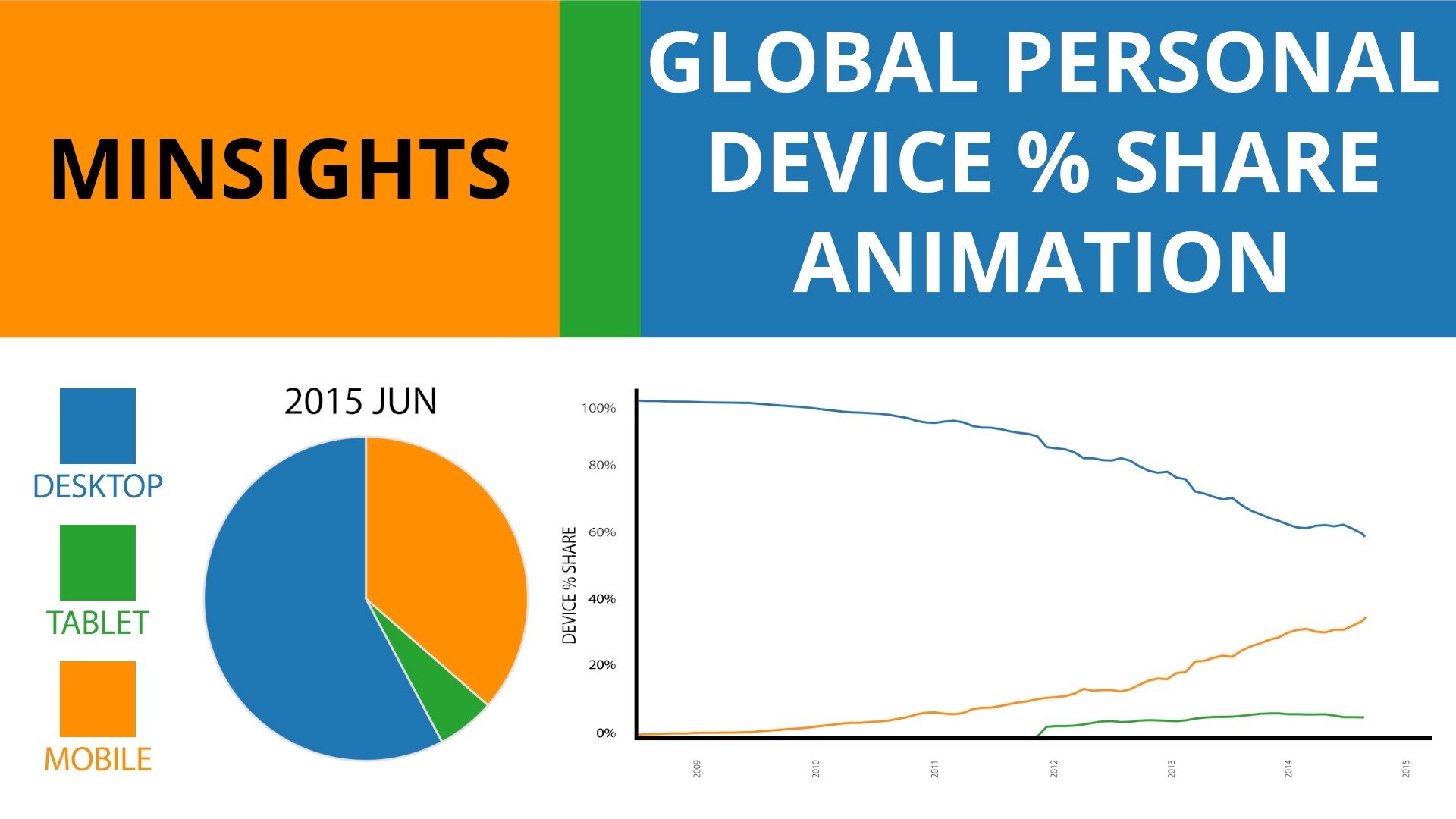
Having been inspired by Viktor Bohush’s recent data viz animations, I decided to give it a try, but kick things up a notch too. You get a video above, with 3 ways to show the data over time (his use of just the bar chart wasn’t 100% perfect in conveying time, so I added a line chart. I also kept it to 30 seconds long. As nice as the music is, people have places to be and things to do :)
I also made this interactive viz below, to let people take their time and explore the data if they wish. Enjoy and let me know if there are any other data sources you’d like me to explore!
