What makes a good data visualization?
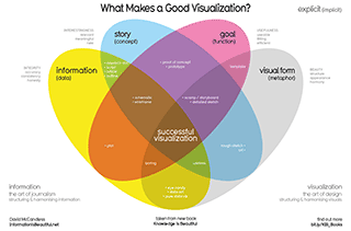
- Positives
- Makes something potentially complex become clear
- Intuitive – readers can understand it in seconds
- The symmetry and colour choices make it pleasing to the eye and encourage viewing (this could have easily become a technicolor mess)
- Insights
- Informs the reader – what might be lacking in their data viz, and what to fix
- Surprising how many data visualisations we see that do not tick all 4 boxes (me included!)
- Most infographics are useless (information + visual form)
- Suggestions
- Potentially make more interactive e.g. Hover over each section to get more details and possible a thumbnail example
Running the Numbers: An American Self-Portrait

- Positives
- Humans don’t process large numbers well. This overcomes that issue, instead of just writing 183,000 birds site each year due to pesticides in the US
- A quick and effective way to convey the scale of the impact of the problem
- Insights
- How many birds die to pesticides per year in the US!
- Suggestions
- This is primarily a work of art, so not fair to fully judge it on being a data visualisation
- But if I did, I would simply put the description of what the birds represent and the numbers at the top – otherwise we couldn’t know how many birds are there in the canvas
London Underground commuter squeeze
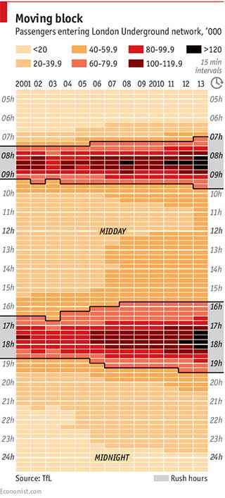
- Positives
- Eyes drawn to the right parts of the visualisation by use of colour hue and intensity
- Additional text labels and borders enhance the insights and ease of use
- Clear and succinct information at tip of viz to help readers understand what they are seeing below
- Insights
- The congestion on the London underground is getting more intense and spending across more time slots as time passes
- I was justified in getting to work at 7am and returning home at 4pm to miss the worsening rush hours
- Suggestions
- Ability to filter by tube station. Enable user to spot trends to have a better commute
- Include a capacity % metric. The busier times will accommodate more passengers, so the increase in commuters might not be as bad as it seems, and visa versa for the off peak times