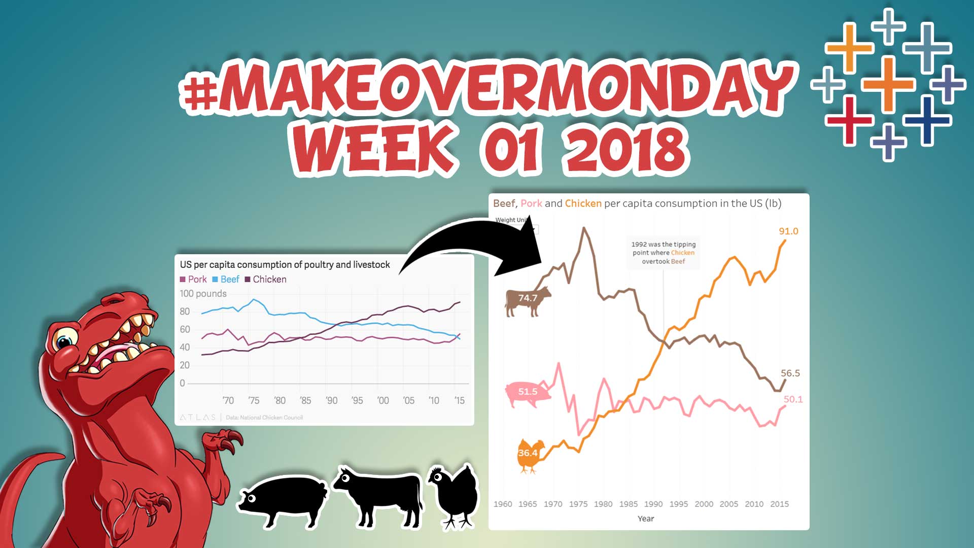
One of my 2018 resolutions was to get more involved with the #MakeoverMonday project, so what better way than to start with its first data set of the year?
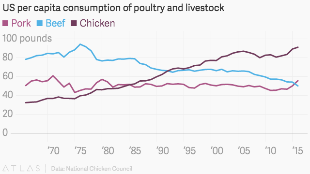
It focuses on the annual per capita consumption of meat (beef, pork and chicken) in the US. Below you’ll see my version, the original version and then some notes of why I chose to approach the data viz in the way I did. Enjoy!
Below you can see the original version, which isn’t bad at all and gets the job done. But with a few subtle tweaks it can be enhanced and become even more effective.
Below is a summary of design choices I made to create my enhanced viz:
- Icons – to make which lines represent each meat more clear and intuitive
- Colours – clear and consistent colours used on the icons, lines, text and numbers representing each meat. The first thing the user sees in the top left is this with the text colour for each meat, and is then reinforced throughout the viz.
- Tooltip – made so it forms a sentence to better describe what the user is hovering over.
- Intro insights – to help tell the story we want the user to see, I summarise to major insights if they don’t want to read the chart or want these insights validated with the chart.
- Weight unit picker – granted the subject matter of the data is the US and they use imperial units, there is a good chance an international audience will see this data viz too. As with date formatting, most of the rest of the world uses the metric system, so I thought it was wise to give any curious international users the option to see things in kg as well as lb.
- Keep It Simple – Whenever I create or enhance any data viz, I always ask myself “what is the objective of this viz?” and work back from that. If anything doesn’t add to this, it is clutter and should be removed. With the objective to see the increase/decrease of different meat’s consumption between 1965 to 2016, the Y axis is removed with the start and end metrics shown, unnecessary grid lines and background colours removed etc.
So there you have it – what did you think of my viz and did you make one of your own? Let me know in the comments below as I’d love to see your take on this weeks challenge.
And if you want to know what the #MakeoverMonday project is or need to tell your friends, I’ve made this short video to help you do just that :)


2 Responses
Great work, with one minor bug: changing units to kg does not change the numbers on the right hand side.
Very appealing graph!
(I came to it via http://www.storytellingwithdata.com.)
The change of units needs retweaking though: changing to kg does not change the final (2015) numbers.