Welcome to Data Chomp! A new bitesize video series from Datasaurus-Rex, aiming to bring you 3 great data visualisations from around the web each week.
You can check out the video above to see me covering each one; briefly discussing why they’re good, what insights we can glean from them and any recommendations to enhance them further.
This series is designed to be bitesize and help expose people to my top picks of good data visualisations from around the web, which in turn I hope inspires people to make more or just see that data visualisation doesn’t have to be boring or terrible.
Shipping lane map
Created by London-based data visualisation studio Kiln and the UCL Energy Institute
- Positives
- Many dimensions at once (time, position, direction, cargo type etc.)
- Clear, easy to spot trends and patterns (compared to regular tables and charts)
- Nice filters for type of cargo, routes, ships etc – hone in on what is important to users
- Embed put on site nice feature
- Insights
- Hubs for small countries like Singapore where only option is sea
- Common routes (safer? Or most efficient?)
- Few boats travelling inland
- Impact of the panama canal
- Suggestions
- Cumulative line charts over time – put scale of things into perspective
- More data – minor, but I could watch this stuff for ages (sign of a good viz)
A timeline of earth’s average temperature
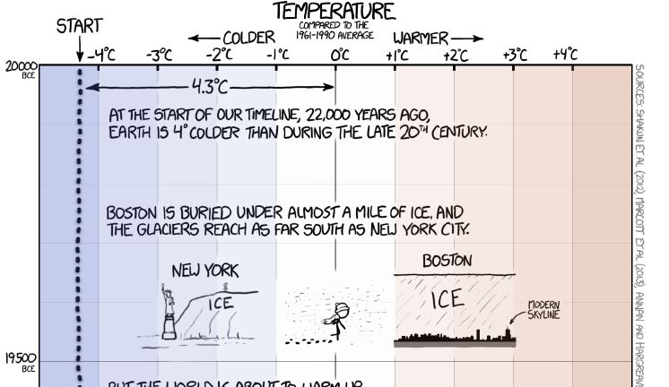
- Positive
- Great idea, beautifully visualised
- Small file size, making it accessible – impressive for it being 15,000 pixels tall!
- Fun and interesting – could have just made it’s point, but the images and text throughout the journey make the reader want to keep going
- Learnthings along the way
- Clearly worded – accessible and easy to understand (see more from the author’s book Thing Explainer)
- Makes the delivery of the main insight much more powerful (could have just started with the end of the chart, but the build up put it’s into perspective
- Insights
- The impact of fossil fuel CO2 emissions on global temperatures
- Puts things into context and makes it hard to dispute
- Suggestions
- Minor, but the freezing of the axis and title at the top to help remind users what they’re looking at could help
UK commuter distance maps

- Positives
- Great way to show how popular locations are for work
- And how far people are willing to commute to them
- Insights
- The commute range for London is far greater than any other major city in the UK, even as far as the north of england (probably not daily)!
- Suggestions
- Not images, make interactive
That’s it for this weeks data chomp. Be sure to subscribe to the channel to keep up to date with everything. See you next week!